Как да покажете процент в кръгова диаграма в Excel – пълно ръководство
In Excel, pie charts are powerful tools for visualizing data distributions, allowing you to quickly grasp the relative importance of different categories at a glance. A common enhancement to these charts is displaying percentages, which can provide clearer insights into the proportions each segment represents. This tutorial will guide you through different methods of adding percentage labels to your pie charts in Excel, enhancing the readability and effectiveness of your data presentations.
- By changing the chart styles
- By changing the overall layout of the chart
- By adding the Percentage label
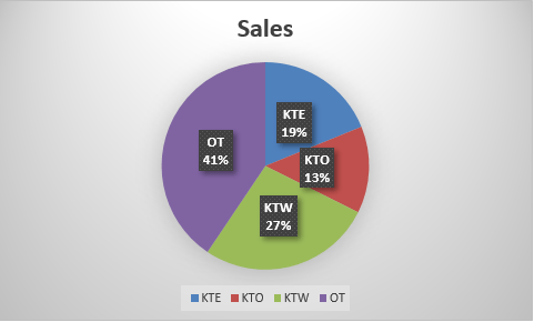
Show percentage in pie chart
In this section, we will explore several methods to display percentage in a pie chart in Excel.

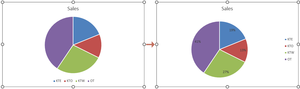
By changing the chart styles
Excel offers a variety of built-in chart styles that can be applied to pie charts. These styles can automatically include percentage labels, making this a quick and straightforward option for enhancing your chart's clarity.
- Select the pie chart to activate the Инструменти за диаграми раздел в лентата на Excel.
- Отидете в Дизайн на диаграма под раздела Инструменти за диаграми, browse through the style options and select one that includes percentage labels.
тип: Hovering over a style will give you a live preview of how it will look.
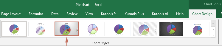
Резултат
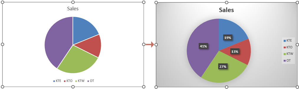
The desired style then applies to your selected pie chart. The percentages should now be visible on your pie chart. See screenshot:
By changing the overall layout of the chart
Changing the overall layout of your pie chart can give you more control over which elements are displayed, including data labels that can be formatted to show percentages.
- Select the pie chart for which you want to show percentage.
- Отидете в Дизайн на диаграма под раздела Инструменти за диаграмиЩракнете върху Quick Layout drop-down list, and then select a layout that includes percentage labels.
тип: Hovering over a layout will give you a live preview of how it will look.
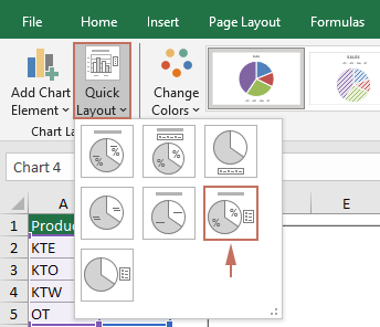
Резултат
The percentages should now be visible on your pie chart. See screenshot:
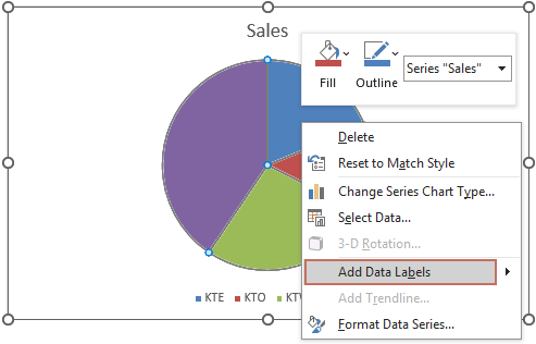
By adding the Percentage label
For a more direct approach, you can specifically enable and customize percentage labels without altering other chart elements. Please follow the steps below to get it done.
- Right click the pie chart that you want to show percentages, and then select Добавяне на етикети с данни от контекстното меню.
- Now data labels have now been added to the chart. You need to right click on the chart again and choose Форматиране на етикети с данни от менюто с десен бутон.

- - Форматиране на етикети с данни pane is now displayed on the right side of Excel. You then need to tick the Процент в полето Опции за етикети група.
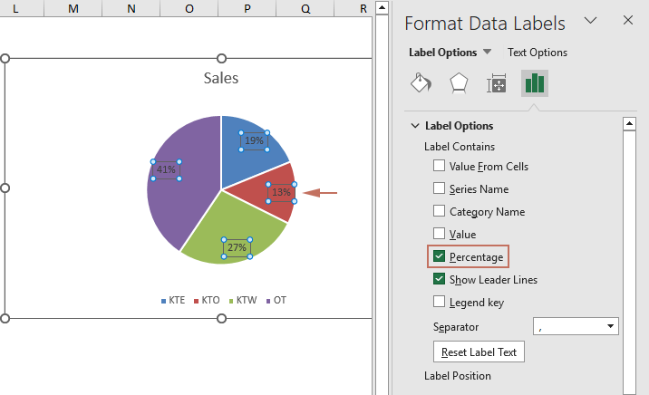 Забележка: Ensure the "Процент" option is ticked. You can then keep any label options you need. For example, you can also select "Category name" if you want both the name and percentage to appear.
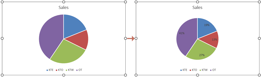
Резултат
Now percentages are shown in the selected pie chart as shown in the screenshot below.
By following the detailed steps outlined above, you can effectively display percentages in your Excel pie charts, thereby making your data visualizations more informative and impactful. Enhance your reports and presentations by applying these techniques to present data in a more accessible and understandable way. For those eager to delve deeper into Excel's capabilities, our website boasts a wealth of tutorials. Открийте още съвети и трикове за Excel тук.
Най-добрите инструменти за продуктивност в офиса
Усъвършенствайте уменията си за Excel с Kutools за Excel и изпитайте ефективност, както никога досега. Kutools за Excel предлага над 300 разширени функции за повишаване на производителността и спестяване на време. Щракнете тук, за да получите функцията, от която се нуждаете най-много...
")
Раздел Office Внася интерфейс с раздели в Office и прави работата ви много по-лесна
- Разрешете редактиране и четене с раздели в Word, Excel, PowerPoint, Publisher, Access, Visio и Project.
- Отваряйте и създавайте множество документи в нови раздели на един и същ прозорец, а не в нови прозорци.
- Увеличава вашата производителност с 50% и намалява стотици кликвания на мишката за вас всеки ден!
")